


Not too long ago, free fonts were either low-quality or utilitarian, designed to substitute for common proprietary fonts like Times Roman or Helvetica. Today, however, a small but growing number of free-licensed fonts can match the best proprietary fonts.
If you doubt that statement, consider the nine fonts listed below. The diagram below will give you the basic typographical terms to understand how to appreciate the fonts and how they are meant to be used:
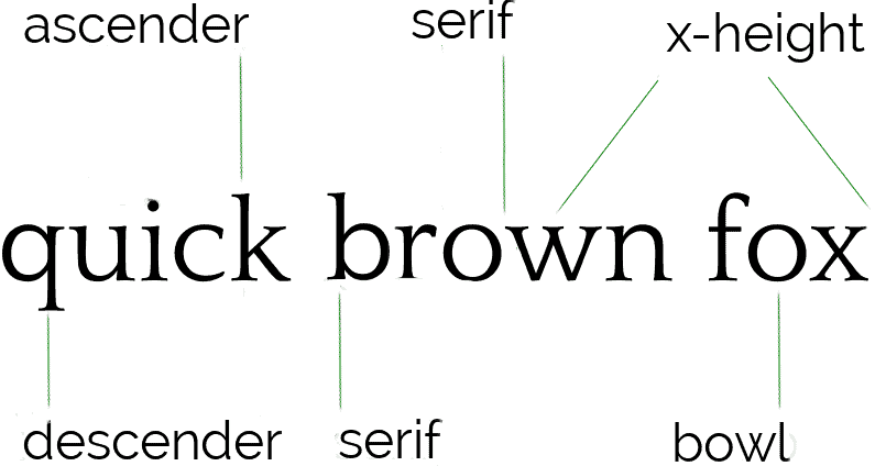
- X-height is the height of a letter “x”, as well as sixteen other letters.
- Ascenders and descenders are, respectively, vertical strokes that rise above the baseline and descend below it.
- Bowls are what we call the rounded parts of letters like “b”, “d”, and “o”.
- Serifs are the small hooks at the bottom and top of ascenders and descenders found in some fonts. Fonts with them are called serifs, those without them, sans-serifs or simply sans.
If you study different font samples, you will see how these elements differ between fonts. After all, if you have names for features, you can more easily observe them.
Now, here are the fonts:
Fanwood
Fanwood is designed by Barry Schwartz, one of the leading designers of free fonts. It is remarkably close to Eric Gill’s Joanna, one of the classic body text serifs. Its letter spacing is tight and its x-height small, so avoid using it with a font size of less than ten points. A darker version, Fanwood Text is also available for reading on e-books.
Gentium
One of the first free-licensed fonts, Gentium, is also one of the most widely distributed. Its serifs have a curve that make it look half like an italic, or maybe a calligraphic font. It gives a modern look to body text, but its letter spacing is tight, so give it extra line-spacing to prevent it from looking cramped. Gentium is available in three variations, all of which are very similar.
Inconsolata
Most monspaced fonts are ugly. Serif monospaced fonts are especially ugly, with oversized serifs. In Inconsolata, Raph Levien has a versatile sans serif that is suitable for everything from a terminal to book headings and body text. The high x-height guarantees legibility, while the differences in the height of the ascenders gives it variety.
Lato
Lukasz Dziedzic’s Lato is available in the Lato, Lato Black, and Lato Hairline families. In all three, it succeeds in enhancing content without calling attention to itself. Well-proportioned with broad lower case letters, Lato is equally suitable for headers and body text. However, all its letter strokes have a tendency to thinness, so avoid using the Regular weight of Lato Hairline for online dcouments, where it almost disappears at lower resolutions.
Oxygen
Oxygen is the official font for KDE. KDE is not the first project to have a signature font, but it is the first to choose a geometric font made of simple shapes. As you might expect of a font intended for use on a desktop, its main use should be for headings. However, its large x-height also means that it is readable at small font sizes. Oxygen is available in Sans and Mono weights.
Quattrocento
Quattrocento comes in Roman (Serif) and Sans families. In both, it is a font whose letter widths and x-heights make it highly readable at any size. Use one family for text and the other for headings, and you have an effective combination, with a variety of small touches, such as a thin “l” and “t” that minimize bad kerning, and a variety of descenders.
Raleway
Matt McInerney’s Raleway is a san-serif with ten typefaces. However, it is designed to have an elegant thinness, and loses much of its appeals at heavier weights. At the opposite extreme, its light weights almost disappear on the page. For that reason, it is best used at the Light, Regular, and SemiBold weights for headings. In these weights, it has an understated beauty of an arte nouveau quality.
Sorts Mill Goudy
Frederick Goudy was an American typographer of the early twentieth century. Sorts Mill Goudy is Barry Schwartz’s take on Goudy Old Style. Goudy is considered old-fashioned today, but Sorts Mill Goudy is under-stated font that can be used for any long stretches of text.
Ubuntu
Available in thirteen weights, including Light, Condensed, Mono and Italic, Ubuntu is a thoroughly modern sans serif font, suitable for almost any use. Irregularities, such as different sized lower case letters and cross-bars on “f” or “t” on only one side of the upright letter stroke give it visual interest without calling too much attention to the font itself. Possibly, though, it is too much a part of Canonical Software’s branding to use in free and open source software circles.
The Increased Selection
These are only a handful of the free-licensed fonts available. An increasing number of projects have their own fonts, such as GNOME’s Cantarell and Mozilla’s Fira. There is also Mint Spirit, Linux Mint’s unofficial font, as well as unassociated designs such as NeoGothic ADF, Nobile, Maven Pro, and Coelacanth.
Increasingly, it is becoming possible to do design work without any proprietary fonts — and if you do need a proprietary font, you may be able to find a near-clone to use instead.
Just call it another free software success story.
—
Source: http://www.ocsmag.com/