


This project was a collaboration between 18F and the U.S. Digital Service. The team was lead by Mollie Ruskin (USDS) and Julia Elman (18F) and made up of designers and developers in both groups, including Maya Benari (18F), Carolyn Dew (18F), Victor Garcia (USDS), Angel Kittiyachavalit (USDS), Colin MacArthur (18F), and Marco Segreto (18F).
Meet Joanne — she’s a young Army Veteran who is looking to make use of her GI Bill Benefits and apply for federal student loans to attend college.
As she tries to access federal programs which will allow her to afford college, Joanne navigates multiple agency websites. She finds dozens; they all seem relevant to what she’s looking for.
Naturally, Joanne is confused. Are these programs related to each other? Are they even all a part of the federal government? Are any of these a scam? When she tries to access the sites during her morning commute, she finds half of them are impossible to use on her phone. She’s overwhelmed by how hard these tools are to use; she feels frustrated and isolated, and worries she might miss opportunities she’s eligible for.
We know that Joanne is not alone. When people go online to access government services, they’re often met with confusing navigation systems, visual brands, and inconsistent interaction patterns. While dedicated federal workers are striving to build helpful digital tools for people like Joanne, our work is still happening in silos, under unique brands and programs.
What this means for users
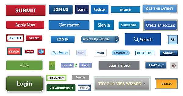
As a result, we spend a lot of time reinventing the wheel and recreating common patterns such as buttons, forms, and search bars over and over again. This creates poor user experiences and wastes American taxpayer dollars in solving the same problems, again and again.
While some federal agencies have created design patterns and UI toolkits to build unity within their own digital brand (see Consumer Financial Protection Bureau (CFPB), US Patent and Trademark Office (USPTO), and Healthcare.gov), we know that this is a time-intensive endeavor and not all agencies have the resources to support it.
To best serve our users like Joanna, we knew that we needed to set a new bar for simplicity and consistency across government services, not just within a given agency or program.
So we asked ourselves: is it possible to create a shared set of tools to provide consistent, beautiful, and easy-to-use government websites?
What we built
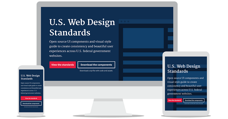
The U.S. Web Design Standards are the U.S. government’s very own set of common UI components and visual styles for websites. It’s a resource designed to make things easier for government designers and developers, while raising the bar on what the American people can expect from their digital experiences. Here’s what you’ll find:
A visual style guide
Typography and color recommendations that are 508 compliant, flexible, and designed for readability and impact.
Common UI components and patterns
A collection of foundational interface elements for government sites and the code that powers them.
We had four goals:
Make the best thing, the easiest thing. We built tools that aligned with the values and needs of digital workers in the federal government, with the goal of driving adoption.
Be accessible out of the box. We created tools that seamlessly meet the standards of 508 accessibility, from colors to code.
Design for flexibility. We aim to give the American people a sense of familiarity when using government services, while allowing agencies to customize these tools to fit their unique needs.
Reuse, reuse, reuse. We reviewed, tested, evaluated, and repurposed existing patterns, code, and designs from dozens of government and private sector style guides to make use of tried-and-true best practices.
The process
The team spent four months rapidly developing and iterating, with some help from colleagues at the Consumer Financial Protection Bureau, Food and Drug Administration, Department of Veterans Affairs, Social Security Administration, Department of Education, the Internal Revenue Service, and the General Services Administration.
We’re excited to be working in the open to create a resource that everyone can own and contribute to; we’ve taken an iterative, user-centered approach to ensure we’re addressing the needs of our end users as well as government designers and developers. Here’s how a cross-functional team of UX, front-end, and visual designers each played a key role in this process:
User Experience
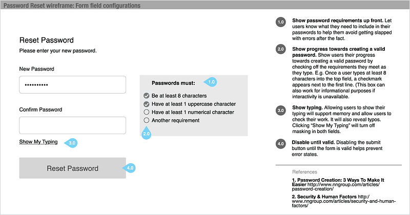
“Making the best thing, the easiest thing” starts with making the standards website itself easy to use. With every iteration of this product, we conducted numerous interviews, usability tests, and card sorts with designers and developers across government. Everything from the site’s organization scheme to its code snippets and download buttons are informed by user research.
The design of every component follows data-informed best practices, found both inside (DigitalGov) and outside (Nielsen Norman Group) of government. Many components were derived from other agency and style guide patterns; more complex patterns were further tested with end users.
We still believe agencies should usability test everything they build, but following the standards will help everyone avoid common pitfalls.
Front-end
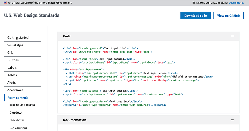
Code: We wanted to create a single reference point for developers in need of common patterns; think about it in terms of building blocks of code for teams assembling websites. Because our goal was to build a system of components shaped by modern best practices, we included code samples in all of our standards and made sure code was 508-compliant and accessible. We also knew that in order for our code to be easy to read and readily adoptable, it had to have a unified voice. After speaking with dozens of frontend developers and designers in government, we sought to strike a balance between modular CSS and code that’s clean and easy-to-use.
UI components: We built the UI components on a solid HTML foundation, progressively enhanced to provide core experiences across browsers.
Styles: Our styles are written with Sass and can be used as a Sass library or included directly as compiled CSS.
Visual design
We set out to create a single common visual style to apply flexibly on a broad range of government platforms. We wanted a clean, modern aesthetic that communicates credibility, trust, and warmth and meets high standards of visual accessibility.
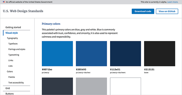
We conducted a branding exercise, auditing dozens of government websites, logos, and brand styles. We tested multiple typefaces, focusing heavily on open source and highly-legible pairings. The font suite we selected — a sturdy serif and slender sans serif — meet a range of layout needs, from polished marketing pages to content-heavy digital services. We landed on a palette of blue, gray, white, and red that can be applied generously or sparingly to create a distinctly American flavor with adaptability baked in.
What’s next
Like any true alpha, this is a living product; we will continue to test our decisions and assumptions with real-world feedback as it continues to develop and evolve. We encourage you to explore the U.S. Web Design Standards, contribute your own code and ideas, and leave feedback on GitHub. We will use your input to improve the standards and make regular releases in the coming weeks and months.
—
Source: https://medium.com